Dynamic Delivery Fees
A fresh update on an MVP to dynamically manage delivery fees and incentives.
Outcome
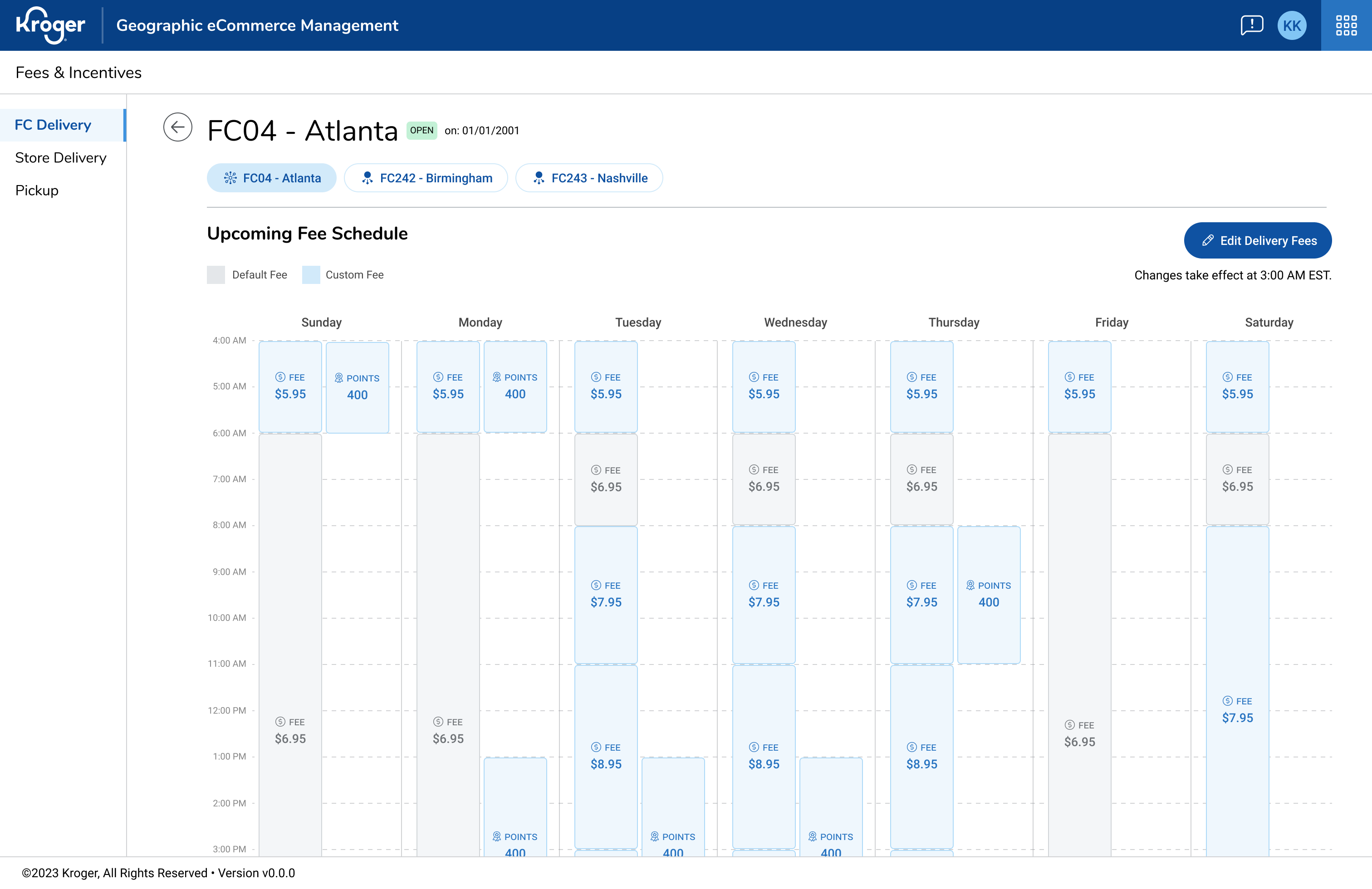
- Shipped a calendar-style scheduler for delivery fees and incentives, aligned to how ops plan time-boxed events (days/weeks) for quick scan and action
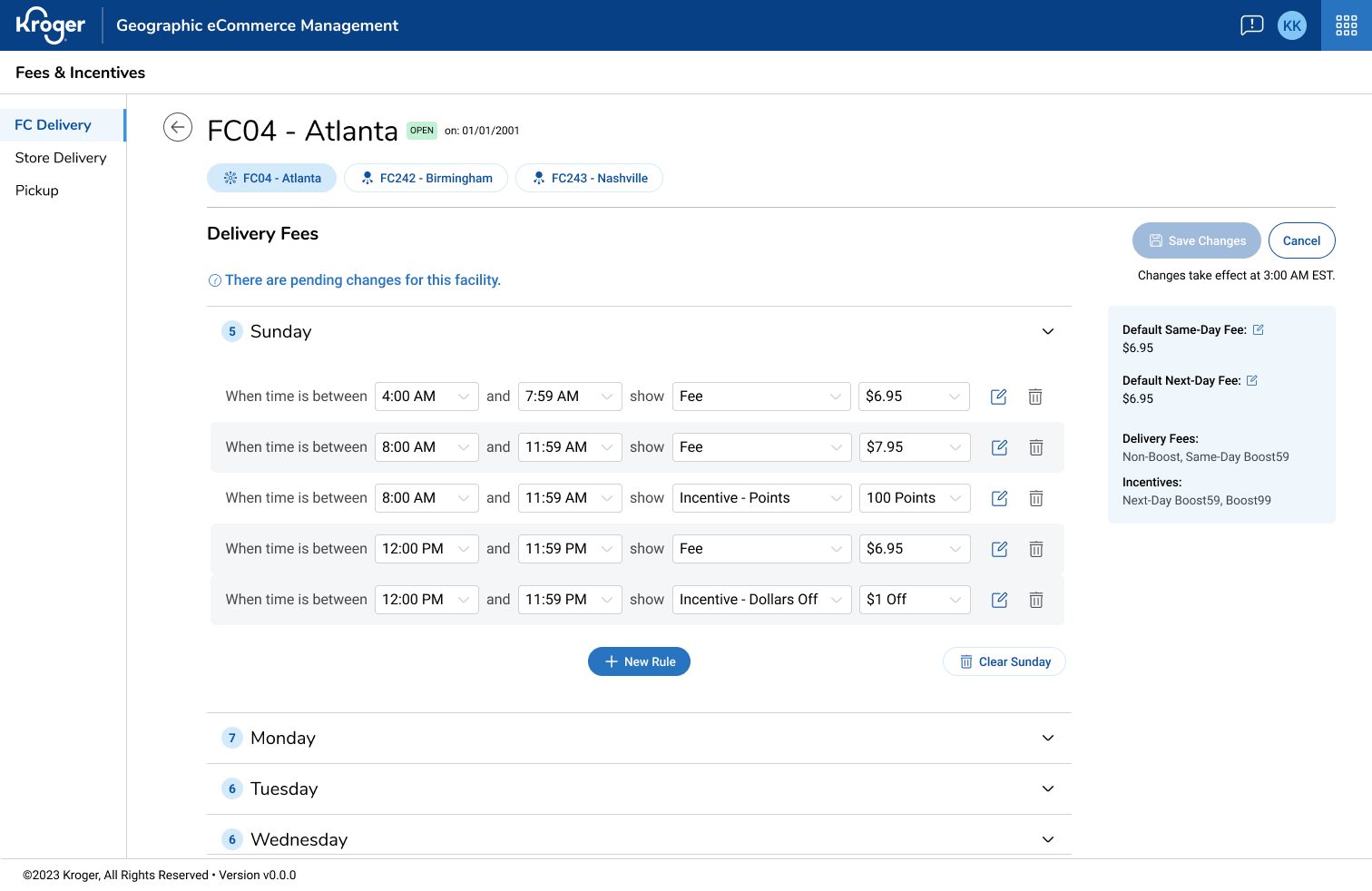
- Made defaults vs. custom rules unmistakable and made edits safer with Save/Revert in a focused Rules Editor; small changes now feel safe and intentional


Evolution of the fee schedule view from sketch to final
Details
Desktop internal tool · Lead product designer · Figma · E-commerce operations/fulfillment
Problem
Large spreadsheets were the main player. Teams couldn’t quickly answer “what fee is live on this date?” Defaults vs. custom rules were easy to mix up, and the narrow side panel made complex edits feel risky. People often opened multiple screens just to reconcile overlaps.
Approach
I met with SMEs to map real scheduling habits, explored timeline vs. calendar concepts, and prototyped flows for create, edit, and resolve conflicts. I reviewed changes weekly with PM and engineering to keep the change simple to ship, and I ran quick usability passes on the core tasks. I aligned visuals with our DS and tuned copy, empty states, and warnings.
Key Decisions
- Calendar grid instead of timeline so overlaps are visible in one scan
- Full-page Rules Editor with explicit save/revert to cut down on errors
- Inline Defaults so the baseline stays visible while editing
- Conflict handling with direct, linkable warnings — e.g., “These overlap on Tue 6/04. Jump to fix.”
Result & Impact
- Time to add a new fee schedule was cut in half, and confidence went up.
- We reused the same calendar pattern for incentives with minimal rework.
- We introduced small UI pieces that we reused elsewhere (event chips, conflict banner). The team nicknamed the view “Outlook” during reviews.


Final versions of the fee schedule and the rules editor
What I’d Improve Next
Cross-FC copy/paste, quick inline edits with Save/Revert, CSV import/export for seasonal planning, and lightweight analytics to track scan time and error rates