E-Commerce Fulfillment Map
Enhancing a complex e-commerce map tool and affording its users greater control.
Outcome
- Unified filters and a sticky scope so people always see what they’re searching—and what changed after each tweak
- Gave users greater control over a mountain of data with overflow-friendly filters and clearer map signals
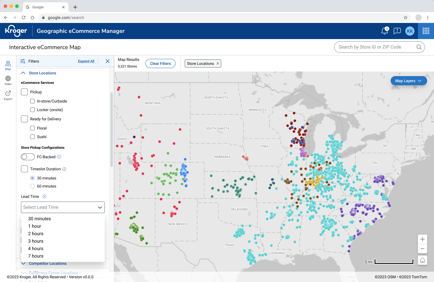
Adding filters and search dimensions
Details
Desktop internal tool · Lead product designer · Figma · E-commerce operations/fulfillment
Problem
Teams needed to answer basic questions—what locations match my criteria? what changed after applying filters?—but the UI hid the scope. Filters were scattered, search feedback was vague, and results didn’t clearly reflect the active criteria. Power users also hit a ceiling: they couldn’t apply more than a handful of filters before the UI broke down.
Approach
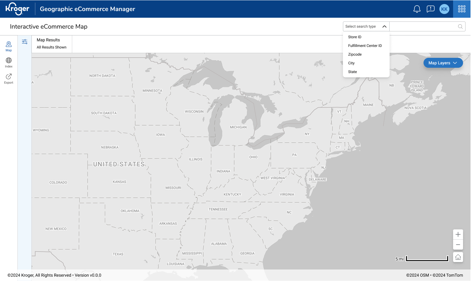
Conducted interviews to watch real searches, cataloged top filter combos, and mapped the path from query → filter → result. Explored vertical vs. horizontal filter patterns and designed a sticky summary that keeps scope and counts visible while scrolling. Added horizontal chip scrolling so people can apply many filters without losing visibility. Partnered with eng on loading states to keep the map responsive, and defined a new store-type visual (icon + color) that stands out on the map without overpowering nearby markers; added it to the filters list. Also explored custom search radius (e.g., “within 50 miles of a point”)—designed flows and validation, but it paused during reorg.
Key Decisions
- Unified filter bar + chips with horizontal overflow so scope stays visible even with many filters
- Sticky results summary (count + scope) for constant orientation
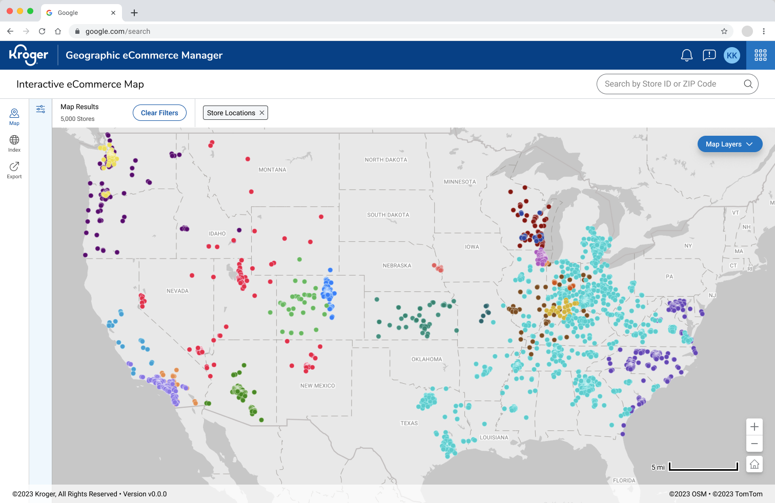
- New store-type icon + color that reads clearly on the map and in the legend; added as a filter
- Explicit search states (no result, partial, stale) with next-step actions
Result & Impact
- Typical location lookups took less time than ever
- Power users applied more filters without losing context thanks to horizontal chip scrolling
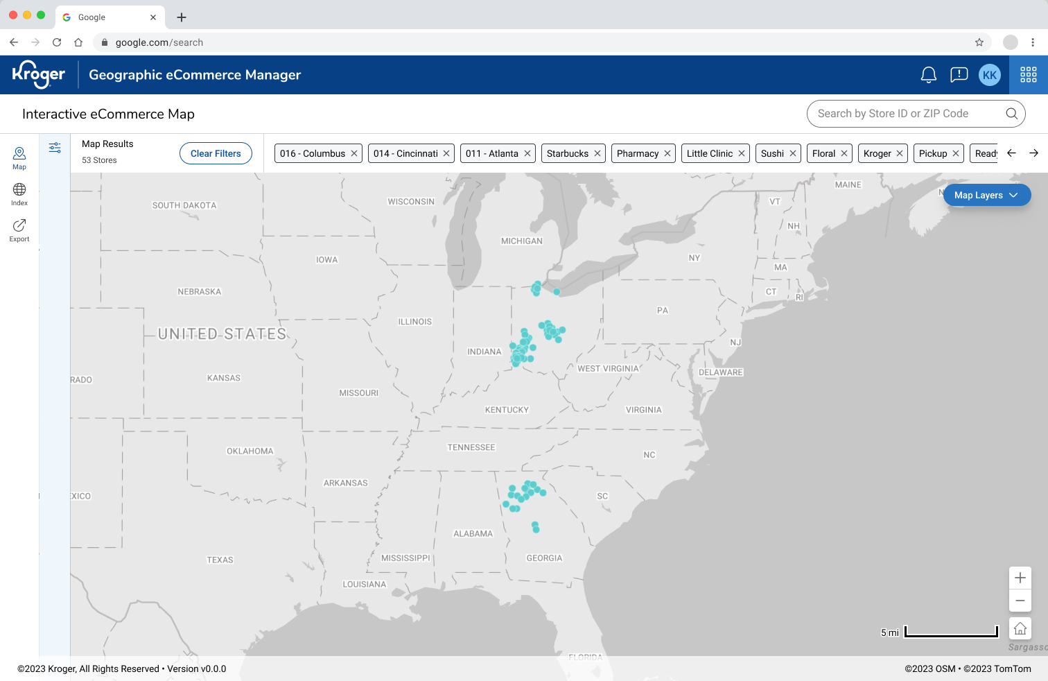
Filter bar horizontal scroll and search results count
What I’d Improve Next
Finish and ship custom radius (type/presets + on-map drag) for targeted searches. Saved filter sets, quick-toggle radius presets, and a lightweight compare mode for two locations side-by-side