Fulfillment Monitoring and Alerting
Optimizing and refreshing an existing fulfillment monitoring and alerting application.
Outcome
- Simplified the monitoring interface for faster scanning and clearer status visibility.
- Added features that give users greater control—including table filters, additive search filters, richer color signals, and improved alert configuration.
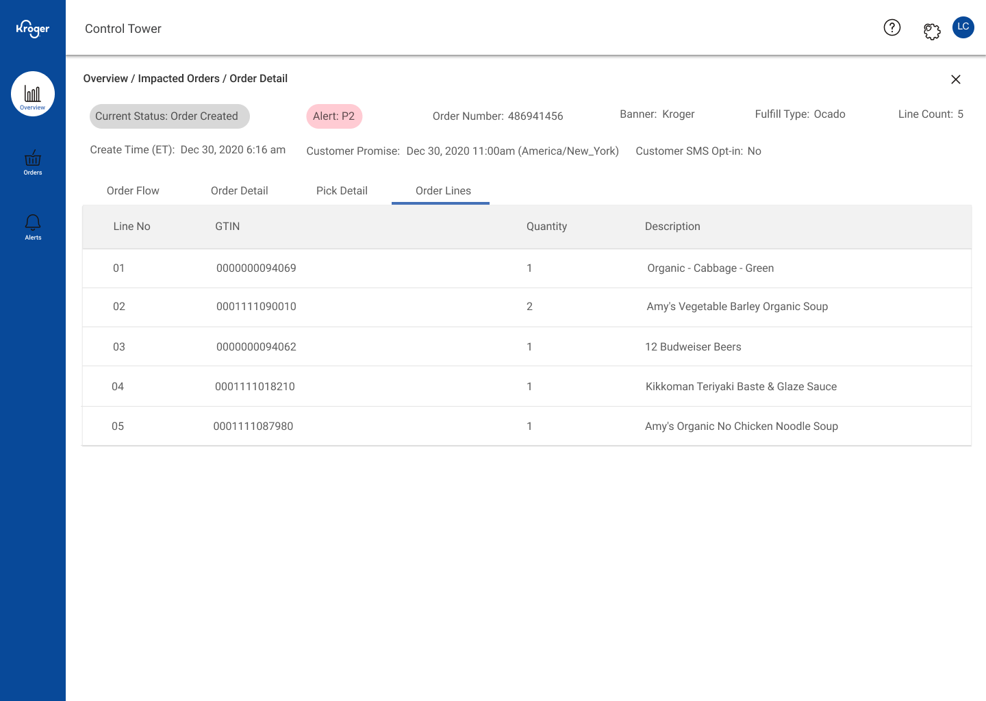
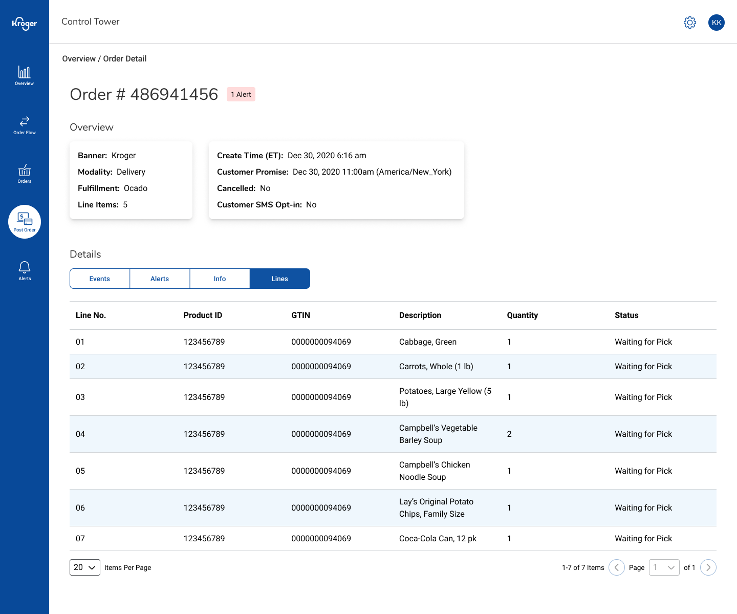
Before and after: Order Detail (my work on the right)
Details
Desktop internal tool · Lead product designer · Figma · E-commerce operations/monitoring
Problem
The existing monitoring dashboard was cluttered and hard to interpret. Users couldn’t filter order statuses, alerts were all the same color, and it was difficult to see how or why an alert had triggered. Search was rigid, offering only a few static options, so users couldn’t build complex queries to narrow results. People spent extra time scanning and cross-checking data to understand what needed attention.
Approach
I worked closely with ops users to simplify the interface and introduce flexible controls. Added filters to the order-status table so users could isolate key issues, and expanded the search page to support additive filters—letting users build custom, layered searches when they needed precision. Introduced color coding to differentiate errors from informational alerts, improving at-a-glance clarity. Extended the alert configuration panel to show trigger conditions and notification details, helping users verify alert logic and ownership.
Key Decisions
- Filters in the order-status table to focus on the most relevant alerts.
- Additive search for advanced users to build complex queries with AND/OR logic.
- Color-coded states (error, warning, info) to reduce visual noise and emphasize urgency.
- Expanded alert configuration showing triggers and recipients for better transparency.
- Simplified layout with more whitespace and grouping to reduce cognitive load.
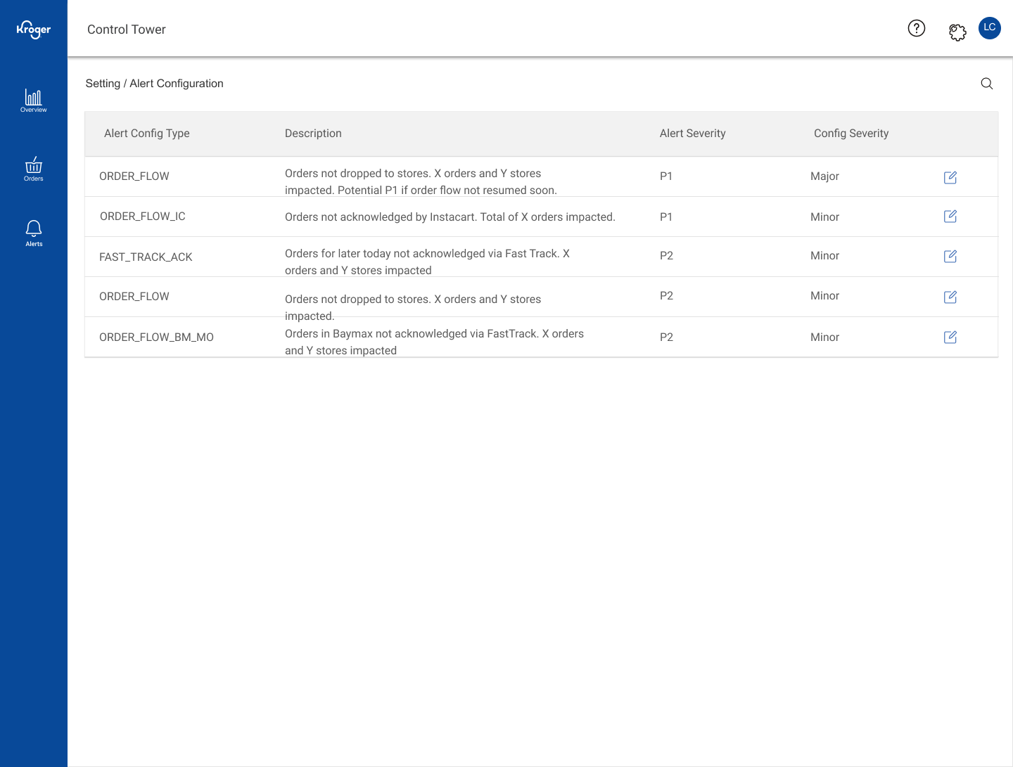
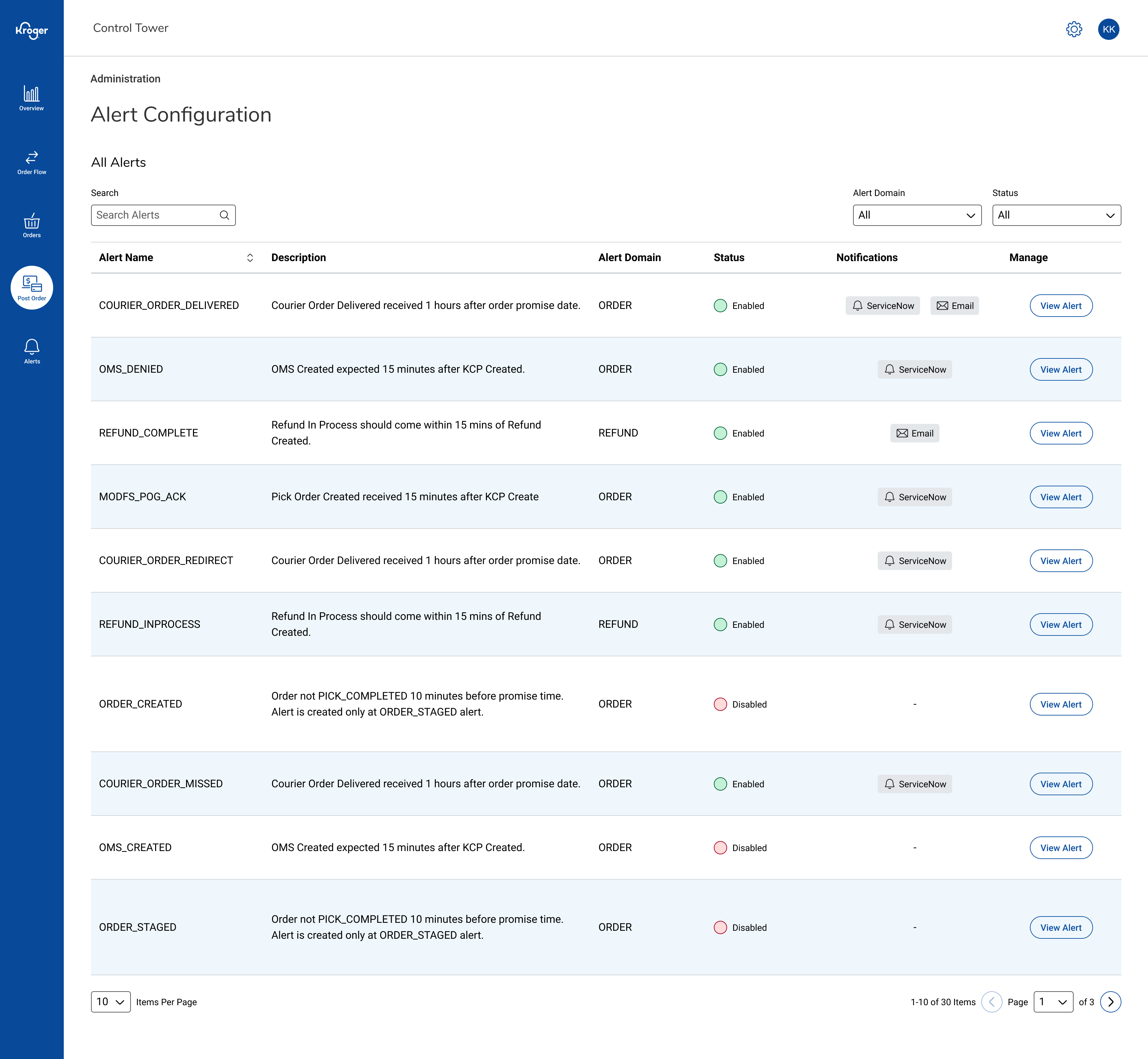
Before and after: Alert Configuration overview (my work on the right)
Result & Impact
- Users could triage issues twice as fast and made fewer cross-checking errors.
- Power users created complex searches to focus on high-priority issues—something impossible in the prior system.
- The clearer alert configuration helped prevent misrouted notifications and reduced confusion around escalation paths.
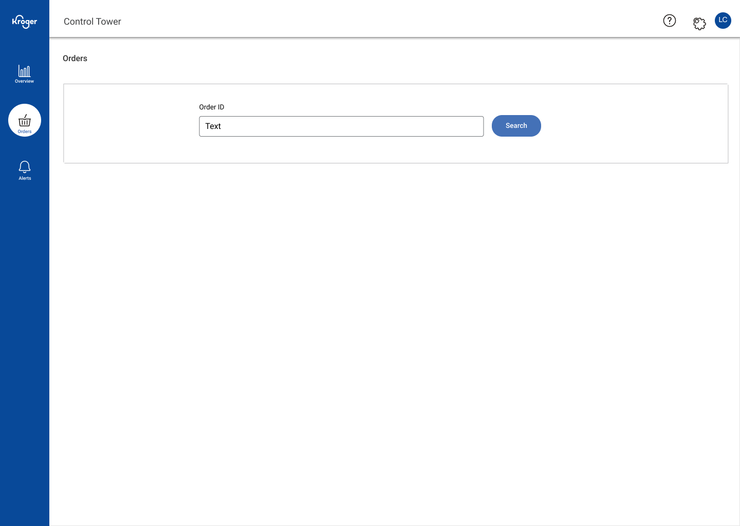
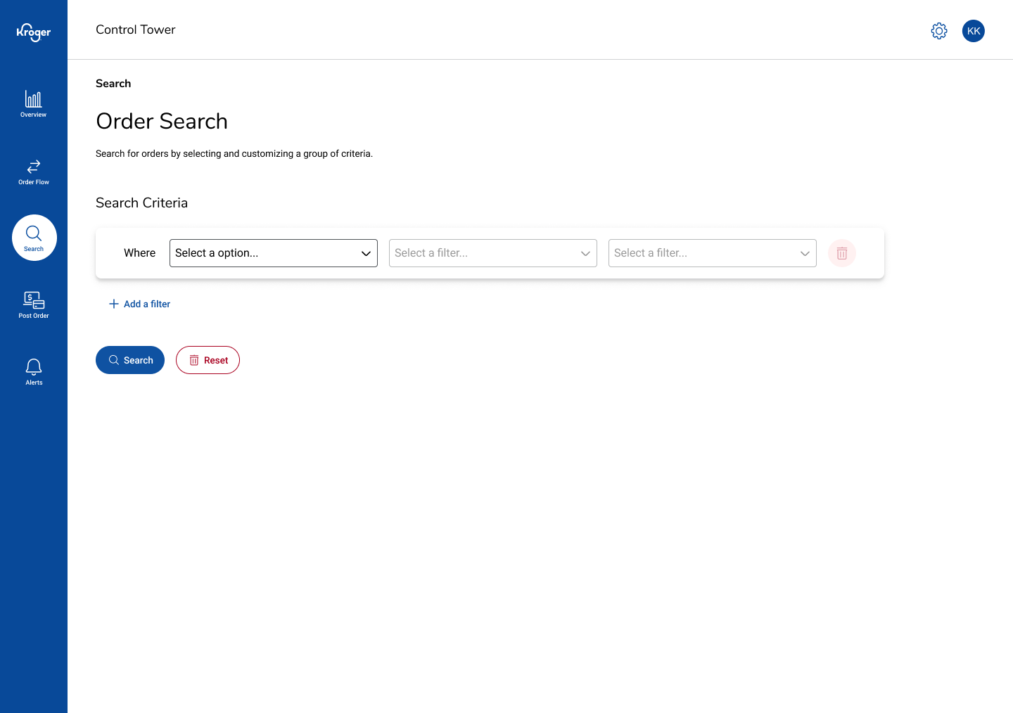
Before and after: Search (my work on the right)
What I’d Improve Next
Add saved filter presets, explore alert grouping by category, and integrate real-time thresholds to notify teams earlier when metrics approach risky levels.