Line Item Replacements Visibility
Enabling greater visibility into e-commerce order line item replacements and substitutions.
Outcome
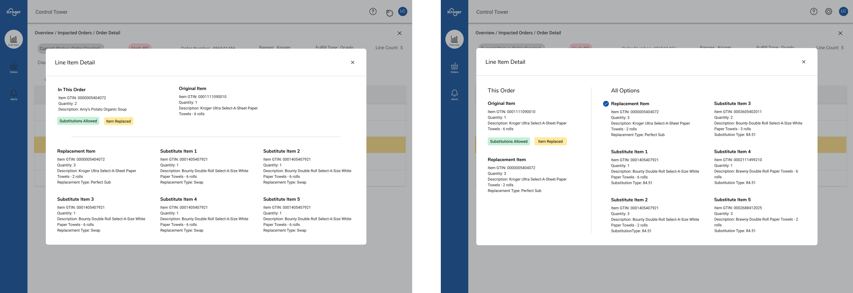
- Introduced a left-to-right review flow so associates can see the original item, suggested substitutions, and near alternatives at a glance.
- Reduced errors and second-guessing by making out-of-stock decisions clearer and improving visibility into how replacements affect orders.
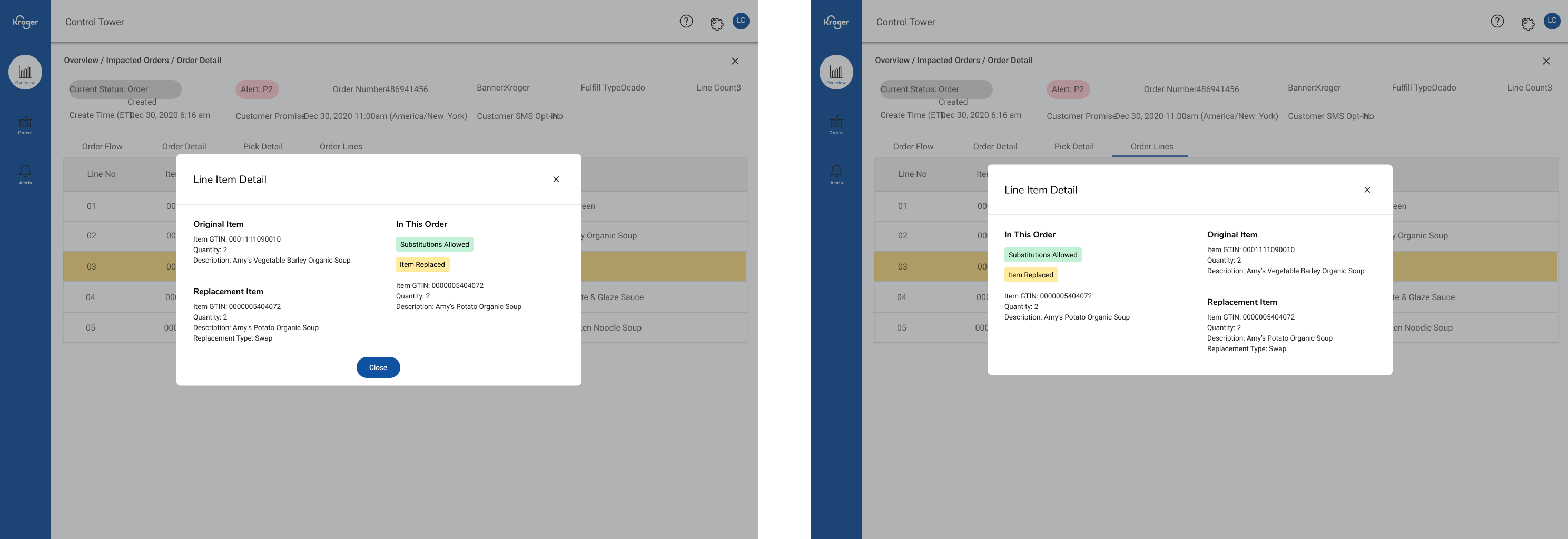
Evolution of the general layout
Details
Desktop internal tool · Lead product designer · Figma · E-commerce fulfillment
Problem
When an item was out of stock, associates had to open multiple screens to compare alternatives. There was no clear distinction between direct substitutions (same item, different quantity or size) and replacements (different product that meets the same need). This slowed fulfillment, confused customer service, and increased the chance of misidentifying stock or substitution issues.
Approach
I redesigned the replacements view into a three-column layout showing the original item, system-suggested substitutions, and near alternatives. Added clear visual indicators for substitution type, item alternatives, and customer preferences so associates could make quick, informed decisions. The goal was to help users complete tasks related to item substitutions faster without losing context.
Key Decisions
- Side-by-side layout showing original, substitution, and replacement options together
- Visual cues distinguishing direct substitutions from near alternatives
- Sticky summary bar showing progress and key order info
Result & Impact
- Enabled enhanced visibility for associates investigating substitutions and replacements logic
- Provided call center the ability to enhance customer experience with detailed information on fulfillment
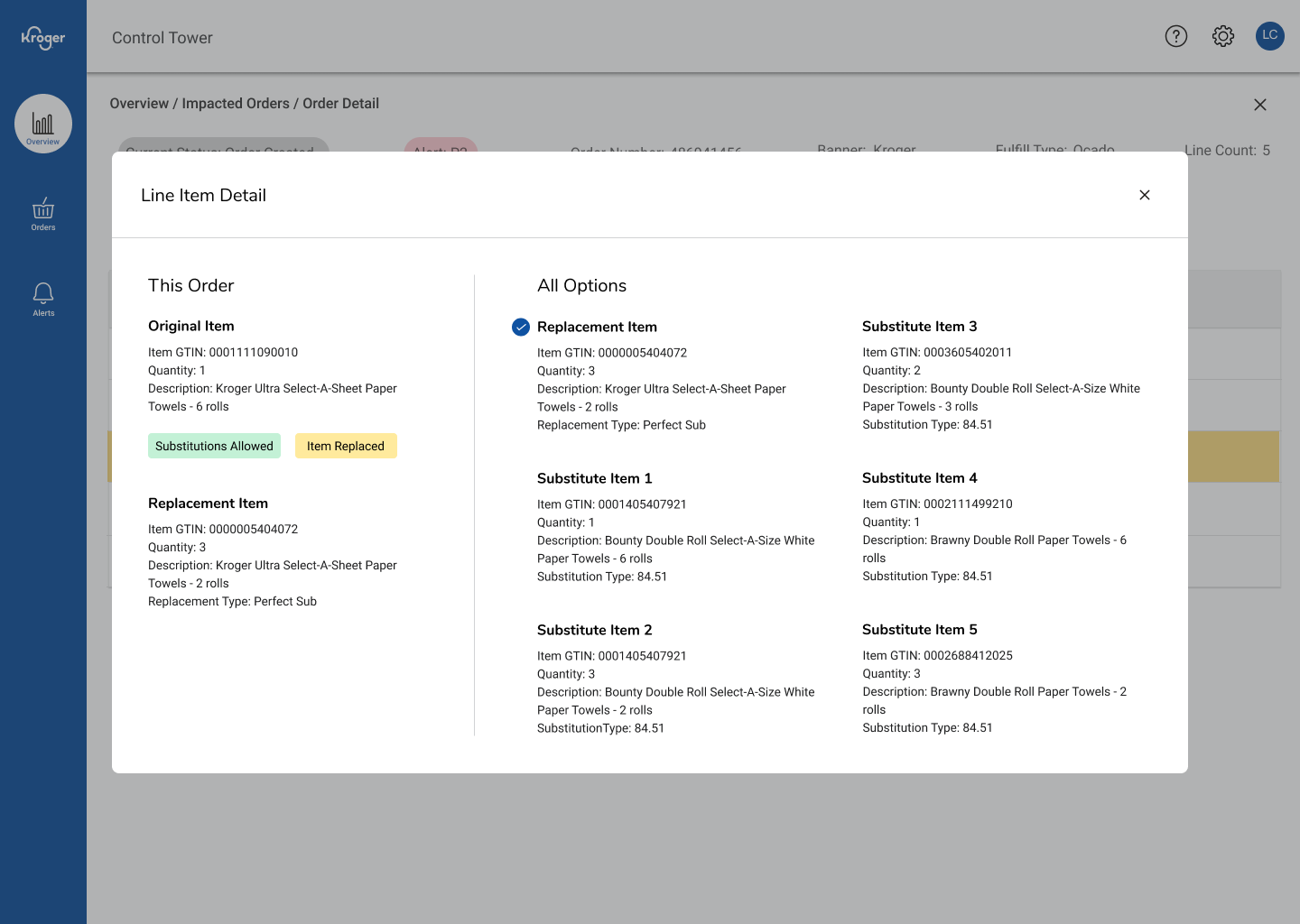

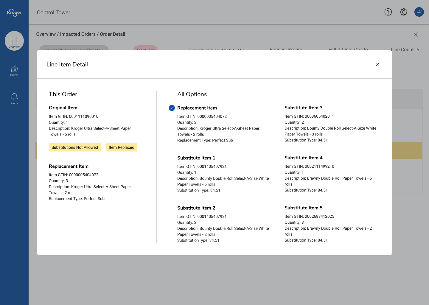
Three scenarios of the final screen
What I’d Improve Next
Add batch review for popular items, more in-depth visual overhaul that minimizes less frequent substitutions, statistics